
In the era of digital data, businesses need not only collect, but also to understand and leverage the maximum value from your data. However, with the volume of data increasingly large, complex work only based on the traditional metrics no longer effective enough. Data visualizations appears as a groundbreaking solution turn the numbers barrenness of the tables easily understood decision support fast more accurate.
This article Lac Viet will help you understand more clearly about the concept of visualizing what is the benefits, types chart popular, the advanced tool to optimize the data analysis in business. This is the handbook for the organization are looking for modern solutions to enhance competitiveness in the digital age.
>>> The same thread: Trend Data Driven what is?
1. Overview of data visualizations
1.1 visualization what is data?
Data visualizations (data visualization) is the process of converting data from one table number, list or database of the chart, image, or map to look at – help viewers to quickly grasp the main information, trends or unusual points in the data.
If for data is the “raw material”, then the visualization is a way of processing help material that easy to “digest” than for users – especially those who don't have expertise in the analysis of data. The visualization helps the viewer does not need to read all the data is still “see” the information in a quick, direct and easy to understand.
Simple example: Instead of viewing an Excel table long 10,000 lines to learn the revenue in each month, businesses can use a column chart or line chart to see even months, how have the sales spike, where is the stage of the sales go down or trend in revenue in the year.
1.2 The core objective of data visualizations
The presentation of data in images not only helps to keep track of, but more important is to support decision-making faster and more accurate. Under angle, business, data visualization to achieve three core objectives follows:
- Turn complex data into easy to understand visual: When a financial statement too many lines and figures, the manager is often difficult to determine where is the important thing. Chart will help focus attention on key indicators – such as net profit, costs exceeded the plan, or sales according to each region.
- Support decisions faster: Instead of losing more time synthesis, reading and analysis, the operator can see dashboard (dashboard data visualization) to capture the activities in just a few minutes, from which given timely action, such as adjusting the budget, change selling plan or allocation of personnel.
- Data connection with business strategyVisualizing data is no longer private affairs of analysis room, which become tools for decision support in general for the whole business. When all the departments are seeing the same picture data, strategy, and action will be consistent, clear and more effective.
1.3 distinguish visualization with traditional reports
Visualization does not replace traditional reports, but it solves the limitation that static reports are often encountered. Below are some of the basic differences to help businesses easily visualize:
| Criteria | Traditional reports (Excel, Word) | Visualization of data (Dashboard, chart) |
|---|---|---|
| Form | Text, table of static | Charts, animations, interactive |
| The ability to update | Update time consuming | Auto updates in real time |
| The ability to analyze | Restricted in presentation and synthesis | Allows filtering, drill-down (go deep into the data) |
| Level easy to understand | Need to read, deduce, calculate | See a tendency to immediately |
| Processing time | Take time synthetic | Quick view, quick action |
Illustrative example: suppose the CEO need to track the performance of 5 branches in the last 3 months. If using traditional reports, each branch will send a Excel sheet, synthetic division to assemble, and calculations, draw diagrams, then presented. Meanwhile, with dashboard, intuitive CEO just open system is seen charts revenue each branch, the trend of increase/decrease, the contribution... everything is updated automatically.
In summary, data visualization is the step from the “data view” to “understand and act upon data” to help businesses not only data efficient but also enhance the ability to react quickly to changes of market and internal organization.
2. Benefits of data visualizations for business
2.1. Increase the speed of decision making
Quickly identify trends or issues: Visualization allows the managers, leaders identify trends, patterns, or problems in just a few seconds. Instead, we have to analyze thousands of numbers, the graph visualization helps to provide clear information, easy to understand, from that accelerate the decision-making process.
Practical benefits:
- Handle information more quickly: According to the study of MIT (2023), the human brain process images faster 60.000 times compared to text.
- Fast response to changes in the market: A dashboard can visually display revenue decreased abnormal or cost spike, which in turn helps the business timely given the solution deal.
2.2. Improve your ability to convey information
Convey the message more effectively: Visual images such as charts, graphs, maps, help convey complex information in a way easy to understand. This supports not only the leader but also help the departments to communicate more effectively when discussing data.
Outstanding advantages:
- Easy to understand: Charts like column, line, or pie chart helps to compare data or display the percentage clearly much more than a table of data.
- Increased interoperability: The dashboard visually allows users to interact, click each section to see details from that capture information more thoroughly.
2.3. Increase transparency and accuracy in data analysis
Minimize errors in interpretation: When data is presented in the chart is intuitive, the risk of misinterpreted or omission of important information will be reduced significantly. Data visualizations to bring a clear picture of comprehensive leadership have accurate view of performance.
Specific benefits:
- Track KPI transparency: Dashboard visualization enables leaders to track performance indicators (KPIS) such as revenue, profit, or effective marketing without reading through series of complex statements.
- Increase accuracy: Eliminate errors due to data entry, or false when the aggregate data from multiple sources.
2.4. Application in many fields
Data visualizations can be flexibly applied in many areas of business, bringing distinct values:
Marketing:
- Analyze customer behavior: Chart heat (heatmap) to help identify any area on the website are customer interaction the most.
- Measurement of campaign results: Dashboard to visually display the results in real time, enabling marketers adjust campaigns as needed.
For example: A company's e-commerce has increased by 20% conversion rate using the heatmap to optimize the website interface.
Finance:
- Track cash flow: Chart cash flow to help identify the stages of expenditure or income, the highest in months.
- Profit forecast: Use the trend chart to predict profits in the next quarter.
For example: A small and medium enterprises have used chart cash flow to improve financial management, up 15% of the liquidity risk.
Supply chain:
- Progress monitoring: Gantt charts help track the status of each stage in the supply chain.
- Demand forecast: Use the scatter diagram to forecast product demand in the future.
For example: A logistics company using Gantt chart to monitor the progress of shipping, discount 10% on-time delivery.
3. The type of chart in data visualizations Data visualization
3.1. The line chart (Line Chart)
The line chart is one of the types of visualization the most popular, used to show trends or changes of one or more data set over time. This chart helps users to easily recognize the tendency to increase, decrease, or fluctuate through each stage.
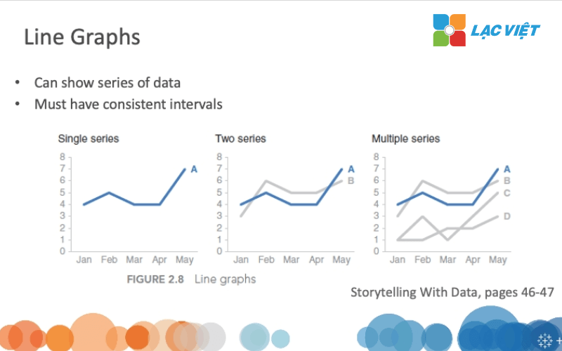
Advantages:
- Easily identify long-term trends.
- Can display multiple data sets on the same chart for comparison.
Practical application:
- Track monthly revenue: Display trend revenue growth of the business through the months of the year.
- Analyze website traffic: Used to evaluate the effectiveness of marketing campaigns through a number of site visits, daily or weekly.
3.2. Column chart and bar (Bar & Column Chart)
Column chart and bar tool is powerful visual to compare data among categories or groups. In which:
- Column chart: Column stand, suitable to display the change over time or a comparison between the small portfolio.
- Bar chart: Horizontal bar, effective in the comparison of data with many more categories.
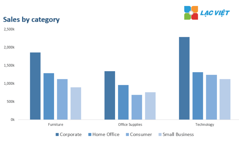
Advantages:
- Very intuitive when need to compare data among categories.
- Easily applied to many fields such as sales, hr or finance.
Practical application:
- Revenue comparison by region: Showing the sales of each region in a quarter, or year.
- Evaluate product performance: Compare the number of products sold between list items such as phones, laptops, accessories.
3.3. Circle graph (Pie Chart)
A circle graph is usually used to show the percentage of each component compared to the total possible. This chart type is useful when you need illustration market share, rate allocation or structural components.
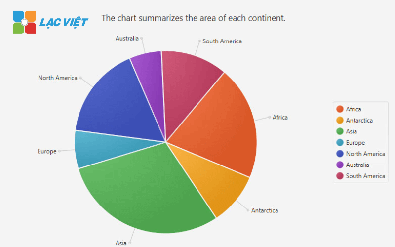
Advantages:
- Easily show the percentage of the components in a data set.
- Suitable to present data in simple, easy to understand.
Practical application:
- Market analysis section: Displays the percentage contribution of each brand in the market.
- Percentage of sales by product: Analysis of the level of revenue contribution of each product group.
3.4. Scatter diagram (Scatter Plot)
Scatter chart is the type of data visualizations are used to display the relationship between two variables. Each point on the chart represents a specific data.
Advantages:
- Effective in the detection of the relationship or correlation between the variables.
- To help identify the outliers in the data set.
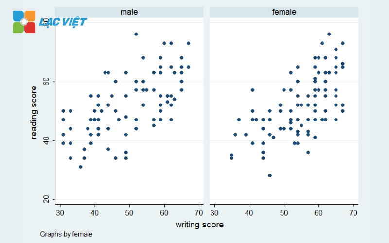
Practical application:
- Analyze the relationship between the marketing budget and revenue: Show the level of impact of marketing spend to revenue.
- Evaluate the effectiveness products: Compare the relationship between cost of production and profit.
3.5. Dashboard overview
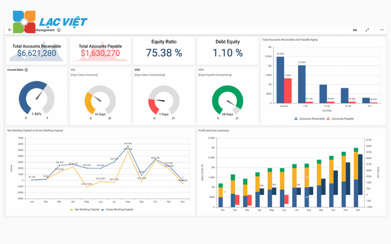
Dashboard is a combination of multiple graphs in a single interface, providing an overview of the entire business data. This is a powerful tool for the managers need to track KPI indicators important real-time.
Advantages:
- Display multiple data sets on the same screen.
- Allows for custom indicators, chart according to the needs.
- Data updates in real time, helping leaders to quickly make decisions.
Practical application:
- Track KPI: Display performance of each of the departments such as revenue, cost, conversion rate.
- Supply chain management: Monitor progress of delivery, inventory levels, transportation costs.
4. The tool Data Visualisation popular best support for business
4.1. Analysis visualization with Tableau
Tableau is one of the top tools in the world of data visualizations, designed to support the business process analysis, presenting complex data in an intuitive way. With drag & drop interface, Tableau easy to use even for those who do not have much technical experience.
Feature highlights:
- Support big data: Tableau has the ability to handle the big data complexity from various sources, including databases, Excel files, the cloud services.
- Custom chart: Users can create a chart, heat map (heatmap), scatter chart, dashboard, multi-dimensional with just a few simple taps.
- Flexible integration: Easy connection with the BI tools, CRM platforms data, such as Google BigQuery, AWS, or SQL Server.
Practical application:
- Track KPI's real-time business.
- Analyze customer trends to optimize marketing strategies.
4.2. Microsoft Power BI
Power BI is a tool that analyzes visual data downloads, be deeply integrated into the Microsoft ecosystem. With the ability to automatically update data, using AI to analyze Power BI is suitable for both small and large businesses.
Feature highlights:
- Automation report: Power BI support to update the data from different sources according to real time reports is always accurate and timely.
- Support AI analysis: Integrated artificial intelligence (AI) to predict the trend suggests solutions, detect anomalies in the data.
- The ability to integrate powerful: Compatible with Excel, Azure, Dynamics 365 and other services of Microsoft.
Practical application:
- Create financial reports with intuitive chart, cash flow, profitability, cost.
- Data analysis, marketing, tracking the effectiveness of advertising campaigns.
4.3. Google Data Studio
Google Data Studio is visualization tool data free, suitable for small businesses or organizations that are looking for simple solution to present data.
Feature highlights:
- Free easy to use: Not required cost to use, provides user-friendly interface with user.
- Integrate well with the ecosystem Google: Support connect with Google Analytics, Google Sheets, Google Ads, BigQuery.
- Share easily: The report can be shared online, real-time updates.
Practical application:
- Track ad performance Google Ads.
- Generate reports on traffic from Google Analytics.
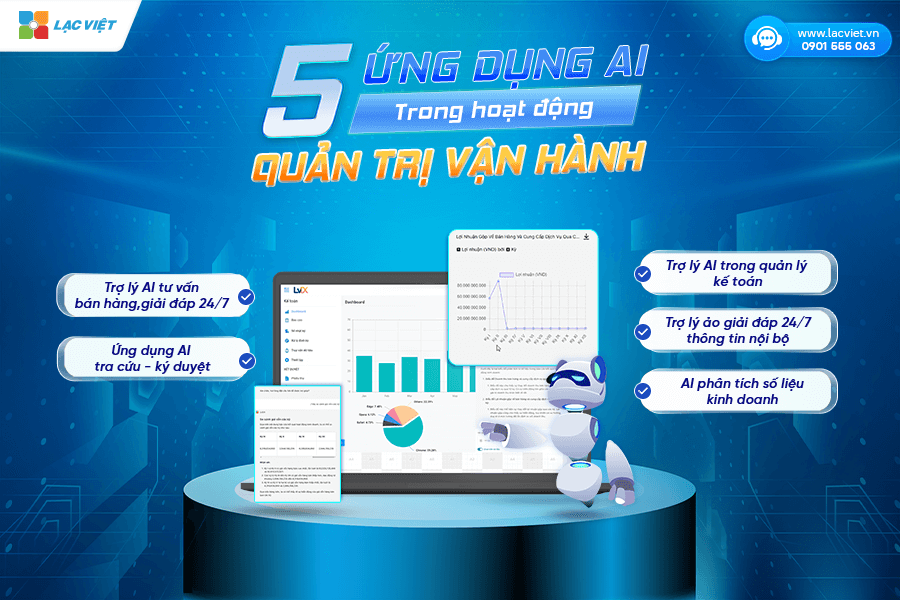
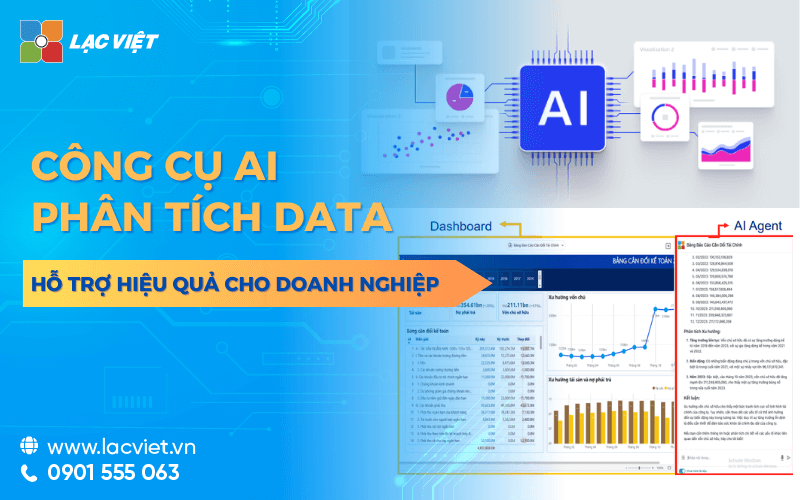
4.4. Financial AI Agent of Vietnam
Financial AI Agent is visualization tool financial data, first in Vietnam by Lac Viet Computing development. Tools data analysis this combination between BI (Business Intelligence) and AI, bring comprehensive solutions for the management, data analysis, corporate finance.
Feature highlights:
- Automatically create financial statements: Including business reports, cash flow, debt, profit chart form intuitive.
- Data updates in real time: Helps leaders easily track financial indicators important.
- Support in-depth analysis: Integrated AI to forecast financial trends, suggesting the business strategy based on effective data.
Practical application:
- Track the financial health of the business.
- Risk analysis, investment opportunities.
4.5. Explore advanced data with QlikView
QlikView is a tool designed to explore advanced data to help businesses detect trends and correlations hidden in large data sets.
Feature highlights:
- Trend analysis-automatic: The tool automatically suggests the important trends from the data.
- Flexible interaction: Users can interact with data, filter, and zoning information need analysis.
- Handle complex data: In accordance with the business have a data set large multi-dimensional.
Practical application:
- Analysis of supply chain efficiency.
- Discovered the relationship between the variables in financial data.
Choosing tools to visualize data matching can bring a big advantage for the business. From the popular solutions, such as Tableau, Power BI, Google Data Studio, to specialized tools such as Financial AI Agent of Lac Vieteach tool will bring back the outstanding features of its own. Consider the needs of the business and begin your journey to optimized data today to gain competitive advantage in the digital era.
5. Application data visualizations in the departments
Data visualization is not only tool to support analysis, but also the solution data connection with the action in each department of the business. Presenting data using charts, dashboard or interactive map to help each department can quickly grasp the situation, problem detection, and timely decisions, more accurate.
5.1 In governance: strategic decisions fast base
For leadership, the must consider dozens of reports from the departments make the catch overview of the entire business become more complex, time-consuming. Data visualizations help shorten the distance between data and action management.
Specific benefits:
- Track performance overall business in real time: Just need to visit a dashboard (dashboard), the leader can see now revenue by region, the rate of profit by product group, effective according to each distribution channel without waiting for the general case from the report discrete.
- Trend analysis quick decisions: For example, if the revenue of the Central region fell unexpectedly in 2 weeks in a row, the system will show the right level of decline in chart form compared with other regions, help leadership decisions timely adjustment.
- Increase the ability to coordinate flexible between the parts: The everything index operation is synchronous display on one platform to help departments understand the general situation, from which coordinate their actions more effectively.
5.2 In accounting – financial: Reduces errors, increases transparency, risk control
With the volume of financial data often fluctuate, department of accounting and finance are in need of a tool to support analysis, just intuitive and accurate. Data visualizations help present the data, budgets, cash flow, debts... in a clear, easy-to-follow and detect problems in a timely manner.
Specific benefits:
- Cash flow management smarter: Businesses can set up a line chart, money out – on by day, week, or month, help track financial volatility in real time and make decisions to spend reasonably.
- Detection financial risk early: If the customer debt exceeds the warning threshold or operating costs spike, the system will display a warning on the dashboard. This helps accounting – finance committee on the treatment early to avoid affecting cash flow.
- Ensure transparency and easy to control: When data are expressed visually, the leader to check back logic to detect deviations rather than reading a long report dozens of sheets.
For example: A company produced using interactive charts to monitor public debt according to the customer. Display system which customers are overdue, industry groups have high npl ratio, which helps finance the initiative handle, avoid risk line, to plan expenditures and production.
5.3 In sales – marketing: optimize the performance of campaigns, and understand customers better
Marketing and sales are two parts of continuous decision based on the feedback of the market. However, if only data is located in the Excel file or periodic report, will be very difficult to react quickly. Data visualizations help these groups efficiently track each campaign almost in real-time to quickly adjust the strategy if necessary.
Specific benefits:
- Measure effective marketing campaign instant: A simple graph can display rate, email open, clicks, conversions, according to each channel (Facebook, Google Ads, Zalo...) help the marketing team know right channels effectively to optimize the budget.
- Track sales activity, buying behavior in real time: Business can know the product groups that are selling, employees whose rate pegs, simple, areas where there is demand spike.
- Analyze customer behavior in more depth: Visual from the CRM system to help clearly see the frequency of purchase, order value, average lifetime customer... from that given the care program, keep your legs fit.
For example: A company e-commerce set dashboard track the effectiveness of marketing channels. When the channel TikTok Ads have a high conversion rate more than Facebook, but the cost is cheaper than 40%, they quickly adjust the budget to this channel. Thanks to that, in the next 2 weeks, the cost per order decreased by 18%, total revenue increased by 12%.
In summary, visualization not only helps to “see data” which is more important to help each departmental action faster, more properly and more efficiently. When all members in the enterprise from leadership to operational staff understand data, has the ability to make decisions based on data, organizations will operate consistent, transparent flexible than before the constant change of the market.
6. Businesses should start from now when deploying data visualizations?
Data visualization can bring huge value, but to develop really effective, businesses need to have a roadmap to deploy properly, starting from the understanding of internal resources, choose the right tools to train end users. Here are three important steps that businesses should take when beginning.
6.1 evaluate existing data, identify the target use
The first step before thinking of visualization is to understand I'm nothing and need nothing. Many businesses have a lot of data, but haven't reviewing or rating see data that was enough or not, there are exactly ready analysis or not.
Businesses need to answer the following questions:
- I'm collecting these types of data (sales, orders, customer, expenses, inventory...)?
- Data are stored focused or scattered in many places?
- The goal when visualization is? To track sales over time? Analysis of expenses by departments? Or cash flow forecast?
Illustrative example: A retail company available sales data, data warehouse and customer information, but haven't connected them. When re-evaluated, they recognize that the target is important to track inventory by region and by season. Thanks to properly identify the needs, they deploy the dashboard to focus on the inventory, combined with sales trends to help optimize the order entry, inventory reduction, slow rotation.
6.2 Selection tool in accordance with the scale, budget
One of the common mistakes when deploying data visualizations that investment is too big right from the start, choose the expensive software or complicated in when the demand has not much team not ready.
Practically, the business can start with these common tools, easy to use, more documentation and have the free version, such as:
- Google Looker Studio (formerly Data Studio): in accordance with small business can connect with Google Sheets or data marketing.
- Microsoft Power BI: business Suit medium – large, can connect with many systems like Excel, accounting software, CRM...
- Excel advanced: With PivotChart, chart action, can still create reports, visual basic, if not ready to use the new platform.
Businesses should consider the following criteria:
- Scale data big?
- Available team of IT/data analysis or not?
- The budget can invest in 6-12 months is how much?
Illustrative example: A medium business in the field of education simply track the number of students, the rate of completion of the course, revenue by year. They choose Google Looker Studio for free, connect with Google Sheets and create dashboard simple. After 3 months, when there is more demand for detailed analysis, they are new to Power BI.
6.3 internal Training and building dashboard template
Although there are good tools, if end users – usually the chief departments, staff operated – 't know how to use the value of data visualizations also not been exploited before.
Business need to do?
- Organize short-term training for team use: how to read the dashboard, how to filter the data, how to make decisions based on the chart.
- Design dashboard template in the correct actual business of each department: finance, expense tracking – sales, marketing efficiently track each channel, track sales rate pegs single week by week...
- Can hire the consultant or specialist outside to build dashboard templates, operating instructions first, then transferred to a team of internal self-management.
Illustrative example: A real estate company development dashboard sales according to the project, combining information on the number of apartments remaining, speed sell, the effectiveness of each broker. After being trained for use, business team to actively monitor the progress of the sale, the proposed policy adjustments immediately without waiting for the total cases reported from other parts.
In the business environment turbulent as today, the ability to make decisions fast, accurate is vital. Data visualizations not only bring clear picture of the situation operation, but also help enterprises detect opportunities, forecasts, risks, optimize business strategy.